Data Exploration: Portfolios of the Poor
Introduction
In this activity, you and a partner will explore microdata from the 2014-15 Zambian Financial Diaries Project. The objectives of this exercise are to:
- discover how data are collected using the financial diaries method
- use R to explore data
- interpret basic output
- analyze trends in the financial lives of the poor
Record your answers on the hardcopy of this worksheet that will be provided in class.
Setup
One student should open this link to the data catalog while the other logs into https://vm-manage.oit.duke.edu/containers. After entering your NetID, click on the link to “RStudio” to begin your R session.
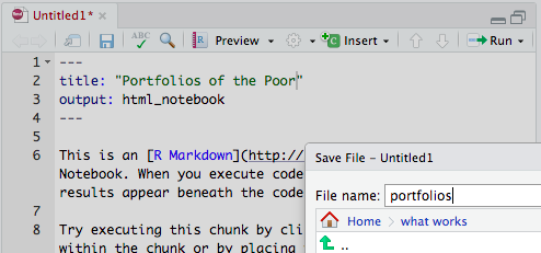
Click on “File” and choose “New File” and “R Notebook”. Change the title to “Portfolios of the Poor”.
Click “Preview”. You will be prompted to save the file. Make a new folder for this class and name the file “portfolios”. When you save, your browser might prompt you to allow pop-ups from RStudio.
- Delete everything from line 6 down.
The Data
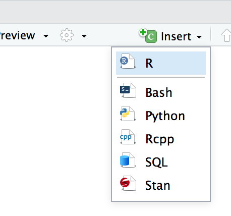
- Now we need to get the data. Use the insert button to insert a new R code chunk.
- Then copy and paste in the following lines to download and load the data files.
  options(scipen=999)
# roster data
  download.file("https://www.dropbox.com/s/d6jmzglw1hwt68c/roster.RData?dl=1",
                "roster.rData")
  load("roster.rData")
# panel data
  download.file("https://www.dropbox.com/s/6ab2nyuotsabgfj/panel.RData?dl=1",
                "panel.rData")
  load("panel.rData")
# events data
  download.file("https://www.dropbox.com/s/kkn1hola3uock7j/events.RData?dl=1",
                "events.rData")
  load("events.rData")
# transactions data
  download.file("https://www.dropbox.com/s/6axdbi2h7s3kgto/trans.RData?dl=1",
                "trans.rData")
  load("trans.rData")
# cross section data
  download.file("https://www.dropbox.com/s/ckv4cgouu5x2yi6/xsection.RData?dl=1",
                "xsection.rData")
  load("xsection.rData")
If successful, you will see five dataframes in the Environment tab. Check out the “Data Description” section of the data catalog entry (not in RStudio) and the User’s Guide to understand each data source.

- Read the User’s Guide to understand key details of the study design.
Roster
Click on
rosterdata frame in the Environment. To make sense of the 33 variables in this data frame, find the correct data dictionary in the data catalog and review the enrollment questionnaire.Make a histogram of the age of people enrolled in the study. Make a new R code chunk (as you did previously) for this code block and each code block to follow. All of your code needs to be inside the blocks that begin and end with three backticks.
  library(ggplot2)
  ggplot(roster, aes(roster_age)) +
    geom_histogram() +
    theme_minimal() +
    labs(title = "Mean age of enrolled study participants at baseline",
         subtitle = "Zambian Financial Diaries Project") +
    xlab("Age") +
    geom_vline(xintercept=mean(roster$roster_age),
               linetype="dotted",
               color="red") +
    annotate("text",
             x=mean(roster$roster_age), y=30,
             label=paste0("Mean age = ", round(mean(roster$roster_age), 1)),
hjust = 0)- What percentage of respondents said they used a bank in the past 6 months?
# counts
  table(roster$roster_finserv_1)
# proportions
  table(roster$roster_finserv_1)/nrow(roster)
What percentage of respondents said they have a bank account? To answer this question, you need to replace
roster_finserv_1with the correct variable name.What do most people in the sample do for a living?
Panel (Refined Events + Transactions by Week)
- Now let’s look at the panel data frame, which is a refined combination of the events and transactions data. Check out the data dictionary for the panel dataset and the “Financial Diaries Instrument Instructions” file under documentation. Here is a snapshot of the one page form (front and back) used to record weekly transactions and events.
Front: 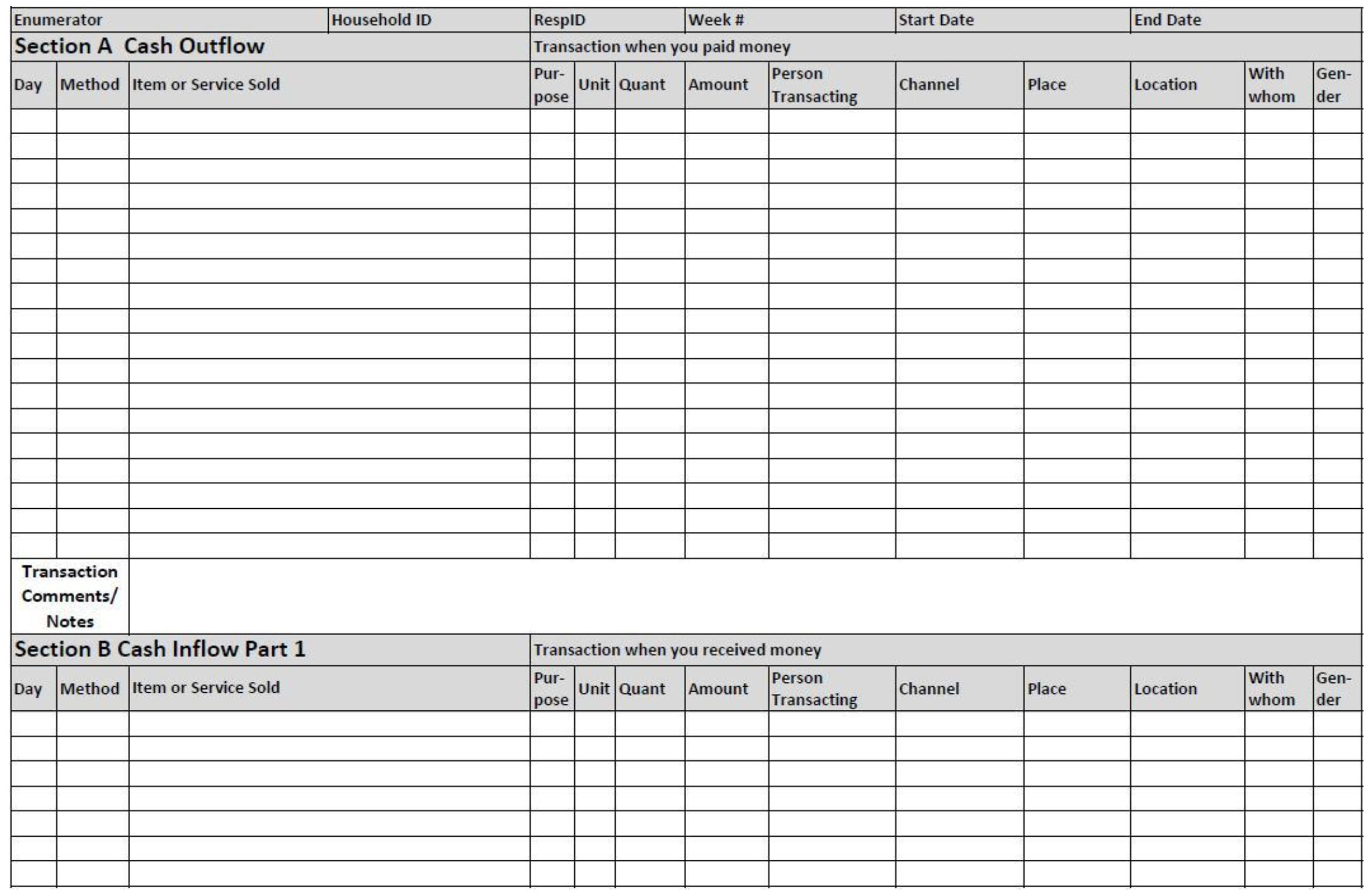
Back: 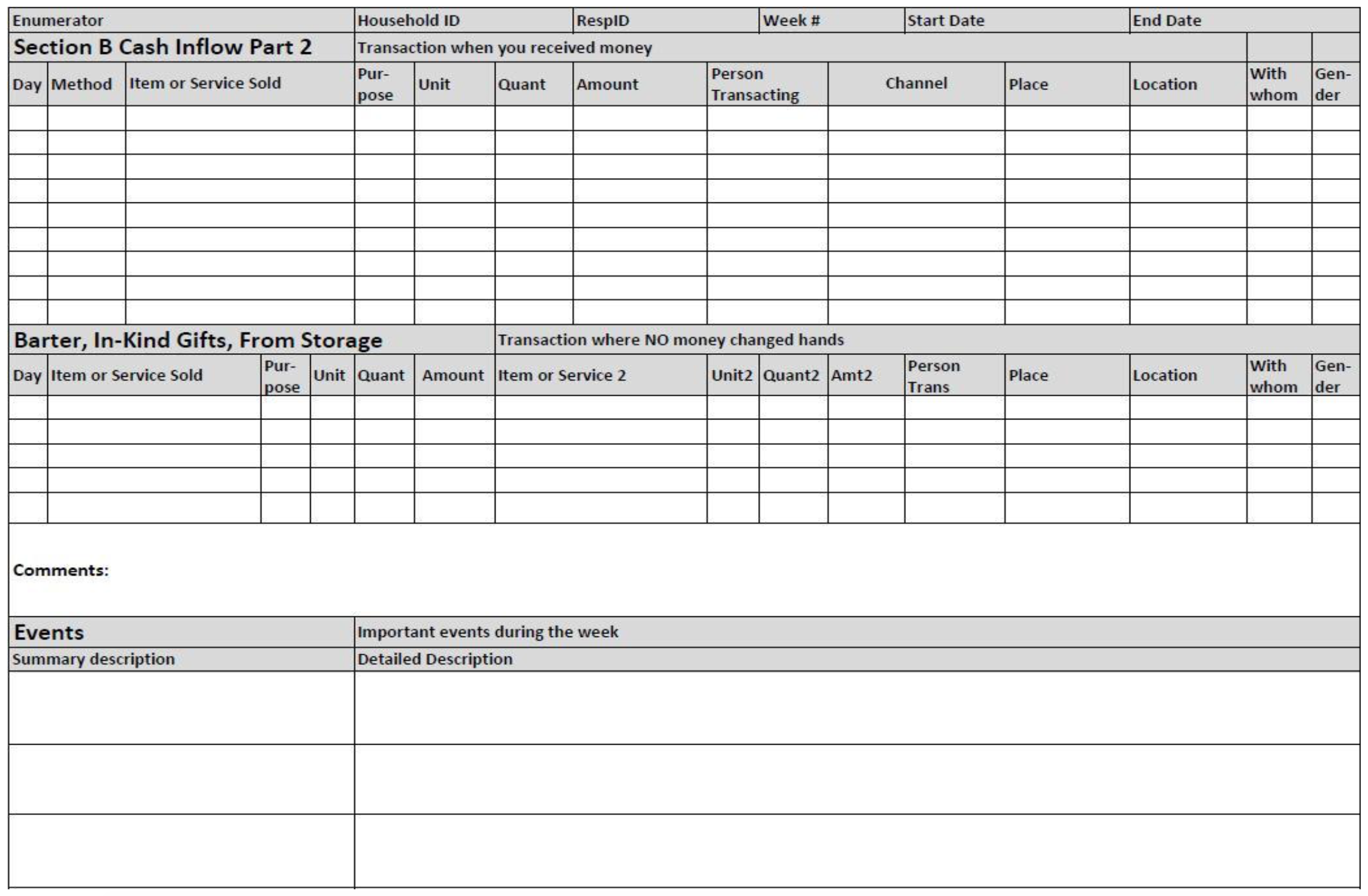
- What was the average weekly income (ZMW) for males and females (excluding dependents)? To run this code chunk, you might need to first run the following command in the console to install the
tidyversepackage:install.packages("tidyverse"). Then you can run this code chunk:
# load tidyverse library
  library(tidyverse)
# summarize by gender
  panel %>%
    # limit to non-dependents
    filter(panel_livelihood != "Dependent") %>%
    # group by gender and calculate mean
    group_by(panel_gender) %>%
summarise(mean_inflow_earned = mean(panel_inflow_earned))- What was the average weekly income (ZMW) by province?
# summarize by province
  panel %>%
    group_by(panel_region) %>%
summarise(mean_inflow_earned = mean(panel_inflow_earned))- Next, construct a new variable that represents the difference between money coming in and money going out on a weekly basis. Dividing by 9.5, the exchange rate at the time, gives you the difference in USD. Look just at a subsample of the folks who worked in Micro-Retail Businesses. What pattern of income and expenses characterizes most of these microenterprise workers? Click on the popout button near the top right of the chart to make it bigger. When the image renders, you should see lots of “small multiples”—little time series plots for each person.
# make a new variable that is inflows minus outflows (in USD)
  panel$diffUSD <- (panel$panel_inflow_all-panel$panel_outflow_all)/9.5
  panel %>%
    filter(panel_livelihood == "Micro-Retail Businesses") %>%
    ggplot(., aes(x=Week, y=diffUSD)) +
      geom_line() +
facet_wrap(~HHID)- Now pick a person with some interesting variation and explore their dataset. Do an ascending sort on the
balanceand visually scan the inflows and outflows for the largest losses over the time series. Can you find anything to help explain why expenses were larger than income?
  person <- ""   # enter the ID between the quotes
  x <- panel[panel$HHID==person, ]
View(x)- How do savings patterns change throughout the year based on livelihood type?
  panel %>%
    group_by(Week, panel_livelihood) %>%
    mutate(mean_savingsdeposit = mean(panel_savingsdeposit)) %>%
    ggplot(., aes(x=Week, y=mean_savingsdeposit)) +
      geom_line() + facet_wrap(~panel_livelihood) +
      theme_minimal() +
      labs(title = "Mean weekly savings by livelihood type",
           subtitle = "Zambian Financial Diaries Project") +
      xlab("Weeks") +
ylab("Average Savings Amount")- Summarize the events respondents reported throughout the year. The coding of free text responses gets more restrictive from
code1tocode4. Excluding day-to-day events, what was the most common type of event?
  table(events$events_code1)
  table(events$events_code2)
  table(events$events_code3)
  table(events$events_code4)
  # excluding day to day
table(events$events_code3[events$events_code4!="Day-to-Day Expenses"])- Stretch goal: Try to ask and answer a question with the dataset.